Posts

Showing posts with the label dyeing

Catching up: face masks

Image
For most of the past year, I focused my blog posts on the making of Jeremy's wedding quilt. The last post where I talked about other projects was back in September, 2019 . I've been working on several other things in these months, and every once in a while, I would title and save a blog post, to remind myself to come back and write about them; there are a half-dozen of these lined up. But I wanted to focus my attention on thinking through and working on the wedding quilt project, so I didn't write up blog posts about other things.  Since I finished that quilt, I've turned my attention to another big project, one I've been thinking about and making forays into since about 2006. I'm getting closer to having something to write about this, but not yet.  So, it's a good time to catch up on the other things I've been doing over the last year, mostly smaller craft work, but also a couple of art pieces. I'll start with a recent craft project. Along with most...

Trimmed edges put to use

Image
I recently trimmed off the edges on some fabric I'd printed up for napkins. Put the strips in the wastebasket, but then pulled them out. Cut some 1.5" squares and made up a 4" coaster.  I've made coasters like this before from commercial fabric I have on hand. Not surprisingly, the coaster made from screen-printed leftovers is even nicer. . .

A new sink for the dyeing studio

Image
No pretty pictures in this post, but if you dye fabric yourself or are interested in how it's done, here's a behind-the-scenes look at one key element of the process: the sink. I'm lucky to have a large space available in my basement where I can do everything connected with dyeing fabric--my "wet studio." The basement has always had the double laundry sink shown in the photo on the left below. The sink was large enough to accommodate two large buckets (I often rinse in one bucket and soak in another), while also giving me the necessary space to wash out all the various containers and equipment that one uses. To the right of the sink, I have a large table with a waterproof covering.  This is where I mix up my dye solutions; there's also a dish rack for the containers/tools that I've washed out. All good, but you can see one problem in the photo below: the difference in height between the table (which is at a good working height) and the sink, which is low a...

In clover

Image
I've been continuing to print napkins, and am especially happy with a new screen I made that's based on a n old drawing of mine of a clover flower.  This  encourages me to work further with elements from some of my d rawings.  I think the two-tone turquoise with dark blue is especially nice, though the two-ton e base was the result of ser endip i ty:  I had mad e a napkin with a light turquoise base fabric and printed my bowl pattern on in a darker turquoise.  There was not enough of a contrast to make it a successful print, so I printed the c lover design over the top of it with dark blue .  Maybe I should do more like this on purpose. . .   the original drawing, 2012

Choosing favorites

Image
Here are my 13 favorites from the 40 or so napkins I've printed in my latest print runs. I like the colors as well as the printed designs. I have more playing around to do with color combinations, but I find I like both the high contrast of black/lighter color as well as the lower contrast of two shades of the same color (turquoise in upper right, rust in center of the bottom row). I mentioned in the last post that I was going to try making a second screen from a screen, in order to get more of a line drawing effect. I did this with the screen on which I'd written text, and I'm happy with how it turned out.  The original screen was used for the navy napkin on the right, below. The lettering drawn on the screen with matte medium served as a resist, so the text appears in the light blue of the original fabric; the added dye becomes the background.  I printed this twice, first with dark blue, then turned the screen 90 degrees and printed with medium blue, which is why you see ...

Seven of 32 printed

Image
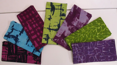
I pulled screens on 7 napkins last Wednesday.  I can layout fabric for eight napkins on my large print table. I have six screens that I'm happy enough with to use. I can re-use a screen in one session if I'm printing with the same color, which worked for the 7th (turquoise) napkin. It took about 2 hours to do the printing. So, it will take me a while to print all the fabric that I've readied for printing (32 napkins total). I may also try making a couple more screens. Here's a review of the prints, and notes about how to proceed with the next prints. The two below were done with two different screens, but each of the screens was made in the same way. This may be difficult to understand without seeing it, but here goes:  I used 2" square piece of plexiglass to stamp rows of squares onto the screen. The stamping medium was matte medium, brushed on with a paint brush cut into so that uneven lines are painted on the stamp, rather than a fully covered surface. Where the...

Playing with color choices in Photoshop

Image
I've set aside Wednesday to go screen print more napkins. I've already experimented with dark blue on plain muslin fabric and dark brown over a lighter brown, reported on  here . After the last session, I dyed up enough muslin for four napkins in each of eight colors, above. (The greens on left and right are a little different from each other.) Today I played around in Photoshop Elements, trying out different colors for the patterns that will be screened onto the fabric. I show the results below, lining them up so I can more easily see see what I'd like to try out. Some of these combinations will not work with dye, because the second color mixes with the first when overdyed in the printing process (unlike paint, which can go on as a separate opaque layer). This is why I've chosen mostly colors close to each other on the color wheel, where the combination will not be so problematic. I've put in bold the colors I'm most likely to try out when printing. Boysenberry...

Back to screenprinting for cloth napkins

Image
About a year ago, I did a surface design workshop with Claire Benn on "Lines and Rows"; I concentrated my efforts on figuring out designs that would work for cloth napkins, 18" square.  I came up with a couple of designs that I liked--squares and bowls, described here .  When I got home, I set to work on developing further designs, as I'd like to have at least four or six designs available for sets of napkins. I printed up six more designs, but wasn't satisfied with them.  I thought if I printed each one again, turning the screen 90 degrees, it was possible they would be more successful.  So I pinned the fabric back on the print table, but then left them for a while to go back to sewing.  And there they lay through the winter, spring, and summer.  A couple of weeks ago, I noticed that I had a container of thickened dye sitting on the back of my work table, and I decided to just go ahead and use it to pull the screens a second time.  Given that the dye ...